
User problem
I wanted to understand the pain points experienced by our Finmo users. To see where the areas of concern were when looking at the most critical functions of the product. Before this project, the user feedback was coming from different channels including customer success, sales, and product. It was documented in multiple areas and was siloed to individual team members. The information wasn’t publicly available unless someone asked and it was very challenging to see everything in a single place. I wanted to change that. My goal was to uncover and display the pain points in a quantifiable format, something more visual that identified the good and not so good areas of the Finmo experience.
Business goals
There wasn’t a business goal when I began this project. This details uncovered here eventually lead to something that fed into the larger product strategy. More on this below.
Since Finmo was created, nobody had attempted to figure out the impact of the design changes we made to the product. Since our users have been using Finmo for years, I wanted to see if the things we’ve done to date were having a positive or negative effect on our users. I also wanted to find out what each user had to say about the most important parts of the Finmo experience.
Research

To begin, I first needed to understand the impact of the design changes. To help figure this out, I leaned on a framework created by Tanner Christensen to define what I would be measuring.
What are user jobs and top tasks?
Clayton Christensen (economist and part creator of Jobs to be done framework) defines a “job” as what an individual really seeks to accomplish in a given circumstance.
Nielsen Norman Group (leaders in user experience research) defines top tasks as "a list of 10 or fewer activities that users should be able to achieve using a design. If users can't do these things, then design has failed.
These definitions were the corner stones that defined critical parts of the Finmo experience.
Finmo’s user jobs and top tasks
I worked collaboratively with another designer and product manager to help brainstorm what these were.
Intaking the application
- Receive details from the borrower portal
- Create application and enter details
- Request and review documents
Underwriting the application
- Pull credit reports
- Create application and enter details
- Review assets and liabilities
- Enter subject property details
- Enter rental income info (if applicable)
- Enter mortgage details
Review GDS, TDS, LTV
- Satisfying lender conditions
- Generate and send disclosure docs
- Collect required signatures
Submitting the application
- Select lender
- Validate application
- Select agent and submission agent
Completing compliance and payroll
- Generate compliance docs
- Collect required signatures for compliance docs
- Review required compliance docs
- Send compliance package to compliance manager for review
Setting up the survey

After identifying the user jobs and top tasks, I then went to our internal experts on the sales and customer success teams. Sales and CS are on the front lines talking with our users on frequent basis. They are the perfect group to double check our work with. I showed them the user jobs and tasks that we created as I wanted their help ensure that everything made sense and that our users would understand the language we used. We walked through each user job and task together to discuss and debate the terms we chose and if the order of things made sense as they understood it.
These jobs and tasks would eventually be converted into survey questions. I also talked with marketing to ensure we weren’t sending out the survey at a bad time. We often have marketing campaigns running so I wanted to ensure we weren’t stepping on each other’s toes or over communicating to our users.
The survey
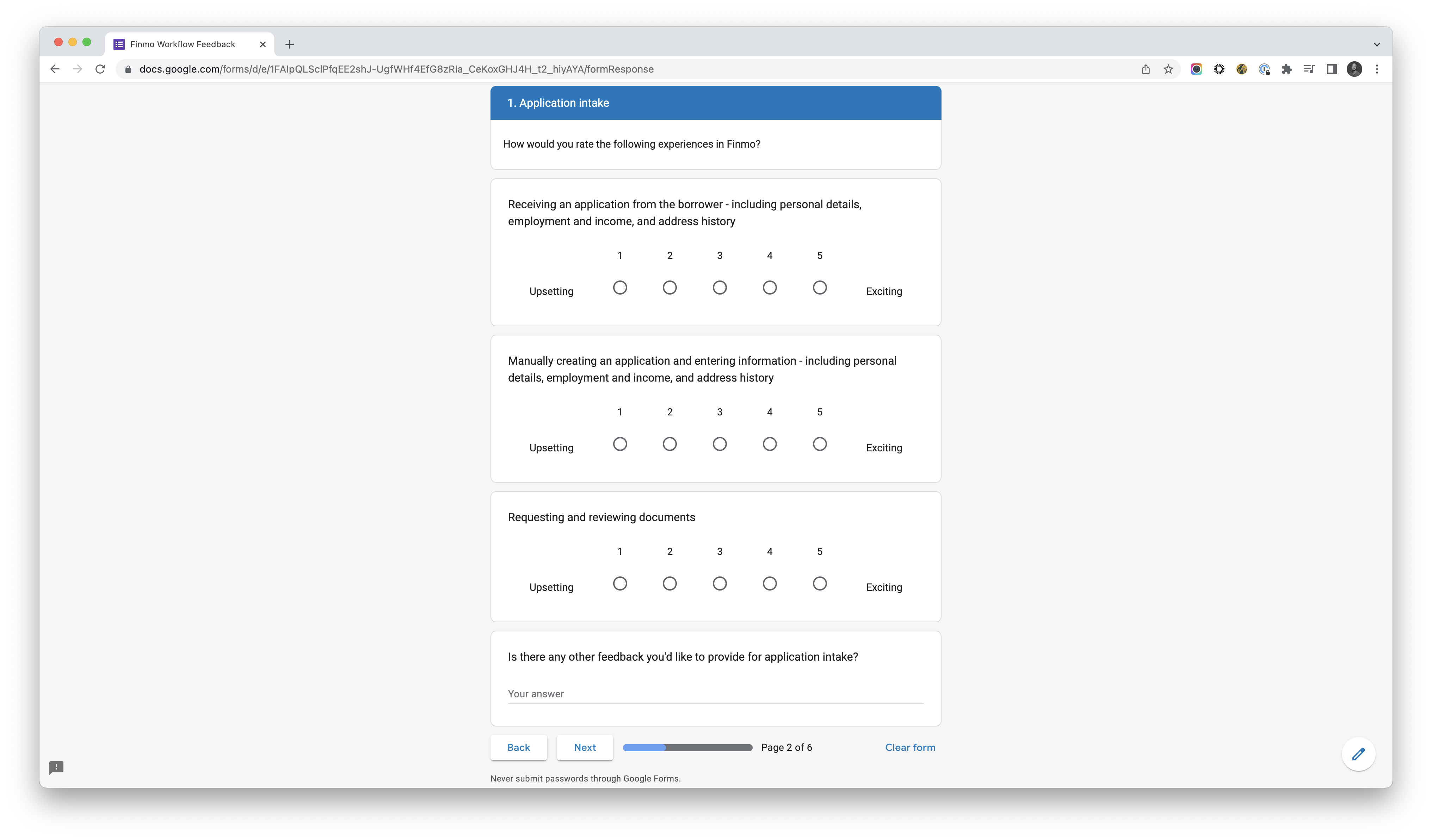
To build the survey, I used Google Forms. I used a mix of mostly scaled (1 to 5) questions and open ended questions to help uncover the best and most painful parts of the user’s Finmo experience. Scaled questions were chosen specifically to make it easy for them to answer.
To help drive a higher number of responses, we offered a contest with a gift card prize for those who would help us answer they survey. As the average response rate is somewhere between 5% to 30% (with 80% being good), there was a chance that we would receive little to no responses.
We launched the survey just before Christmas break in 2021.
Project impact and metrics
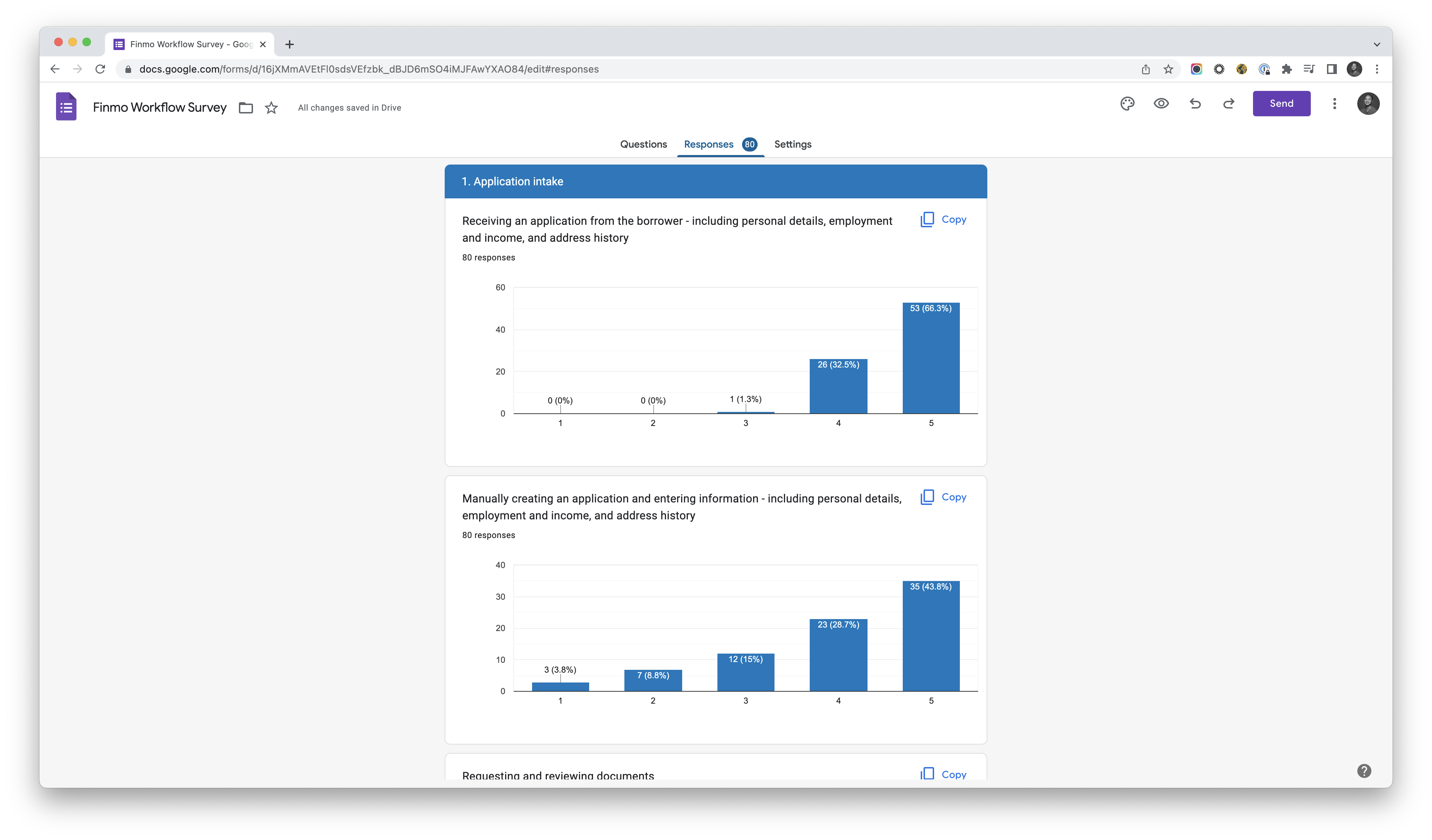
We ran the survey for 5 weeks, received 80 responses, and had a response rate of 15%.
The average score for the Finmo experience was 3 out of 5. Not great overall, but not the worst either. We discovered from individual user feedback that they didn't actually find Finmo too bad in terms of overall experience. There were definitely areas of pain in the workflow though and we expected this as we’ve been hearing about it from our teammates from their discussions.
Even though the overall score from the survey was mostly good, my goal was to identify pain points. Looking at it critically, I was mostly concentrated on the lower (red) scores of 1 or 2 out of 5. Going forward, we chose to mostly ignore the better (yellow and green) scores of 3 or 4 out of 5.
The qualitative feedback we received as a part of the survey questions would help to paint a better picture of why certain areas of Finmo received a score of 1 or 2.
After exporting the Google Form data into a spreadsheet, I further massaged and modified the details to make it more visually pleasing and easier to digest.
Finmo tasks prioritized by lowest scores:
- Manually creating an application and entering info
- Generating and sending disclosure docs
- Collecting required signatures for compliance docs
- Collecting required signatures for docs
- Reviewing required compliance docs
- Sending compliance package to compliance manager
- Validating the application
- Generating compliance docs
Grouped by workflow areas:
- Manually entering details or underwriting the application
- Validating the application
- Disclosure documents and compliance review
After sharing the modified details, I had discussions with our customer success, sales, and product teammates to confirm if the feedback in the survey matched what they were hearing from their discussions. No surprise, it did.
I received a lot of positive feedback for this project. This data was later used along side other data points to inform our 2022 product strategy for the quarter. As a part of the strategy, we're using it to inform our justification for tackling known UX issues. It became one of the product OKRs.
Overall, the research progress was a success. My goal was to learn about Finmo’s good and bad areas and identify the the most concerning pain points for the critical functions. I was able to consolidate all feedback into a single source of truth, make it visually appealing, and share it to all teammates. As a bonus, we also have actionable plans on how to tackle it going forward.

