Context and stakes: Why this mattered


Finmo and Lender Spotlight served overlapping users but behaved like separate products. While some brand alignment existed, core interaction patterns, visual hierarchy, and component behavior diverged significantly.
This showed up as:
- Increased cognitive load when users moved between products
- Uncertainty about whether actions were interactive or informational
- Inconsistent navigation, controls, and feedback patterns
The deeper risk wasn’t visual inconsistency, it was erosion of user trust in how the system behaved.
When structure and behavior are inconsistent, users stop relying on intuition and start double-checking everything.
Ownership and action: What I took on
There was no single owner for cross-product UX consistency.
I stepped into that gap by:
- Framing design inconsistency as a user trust and efficiency problem, not just a visual one
- Taking ownership of defining which inconsistencies actually mattered and prioritizing them
- Balancing long-term system health against short-term delivery pressure
My role was not to “ship a design system,” but to reduce complexity without destabilizing existing workflows.
Strategic framing: The real design problem
The real problem wasn’t “we need a design system.” It was:
Users cannot reliably predict how the system will behave as they move through complex workflows.
Symptoms included:
- Too many button styles signaling different importance
- Modals with unclear intent (informational vs. action-oriented)
- Poor hierarchy between page structures and content groups
- Navigation and interaction cues that competed with each other
Research and system definition: How I approached it


Component and pattern audit
We audited every interactive element across both products:
- Buttons, inputs, modals, tables, icons, and feedback states
- Including default, hover, disabled, and error states
The goal wasn’t cataloging, it was identifying:
- Redundancy
- Ambiguity
- Inconsistent meaning
Decision criteria
We evaluated patterns based on:
- Predictability: Can users anticipate behavior?
- Cognitive load: Does this add unnecessary decision-making?
- Accessibility: Contrast, hierarchy, and legibility
- Scalability: Will this still work as the product grows?
Strategic decisions and tradeoffs

Decisions made:
- Reduced buttons to three semantic types to clarify intent
- Simplified modals into display vs. action-oriented to reduce user hesitation
- Increased contrast and hierarchy to clearly distinguish interactions from content
- Shortened input heights to reduce scrolling in dense workflows
Tradeoffs navigated:
- Accepted short-term inconsistency during phased rollouts to avoid larger disruptive changes
- Prioritized typography and hierarchy first as the lowest-risk, highest-impact changes
- Deliberately avoided forcing adoption without a clear business driver
Knowing when consistency helps — and when it harms trust.
Outcomes and leverage: What changed
User and experience outcomes:
- Reduced scrolling and visual noise in data-dense workflows
- Improved clarity around what is interactive vs. informational
- Increased readability and accessibility across products
Team and system outcomes:
- Created a shared UX vocabulary across teams
- Reduced design and engineering decision overhead
- Provided a foundation for future platform-level consistency work
What didn’t happen and why:
The full system was not fully rolled out.
This wasn’t a failure of design quality, it was a business alignment gap. Without a narrowly defined, high-impact entry point, the system competed with revenue-critical work and stalled.
Design system assets
Typography, Colours, and Navigation


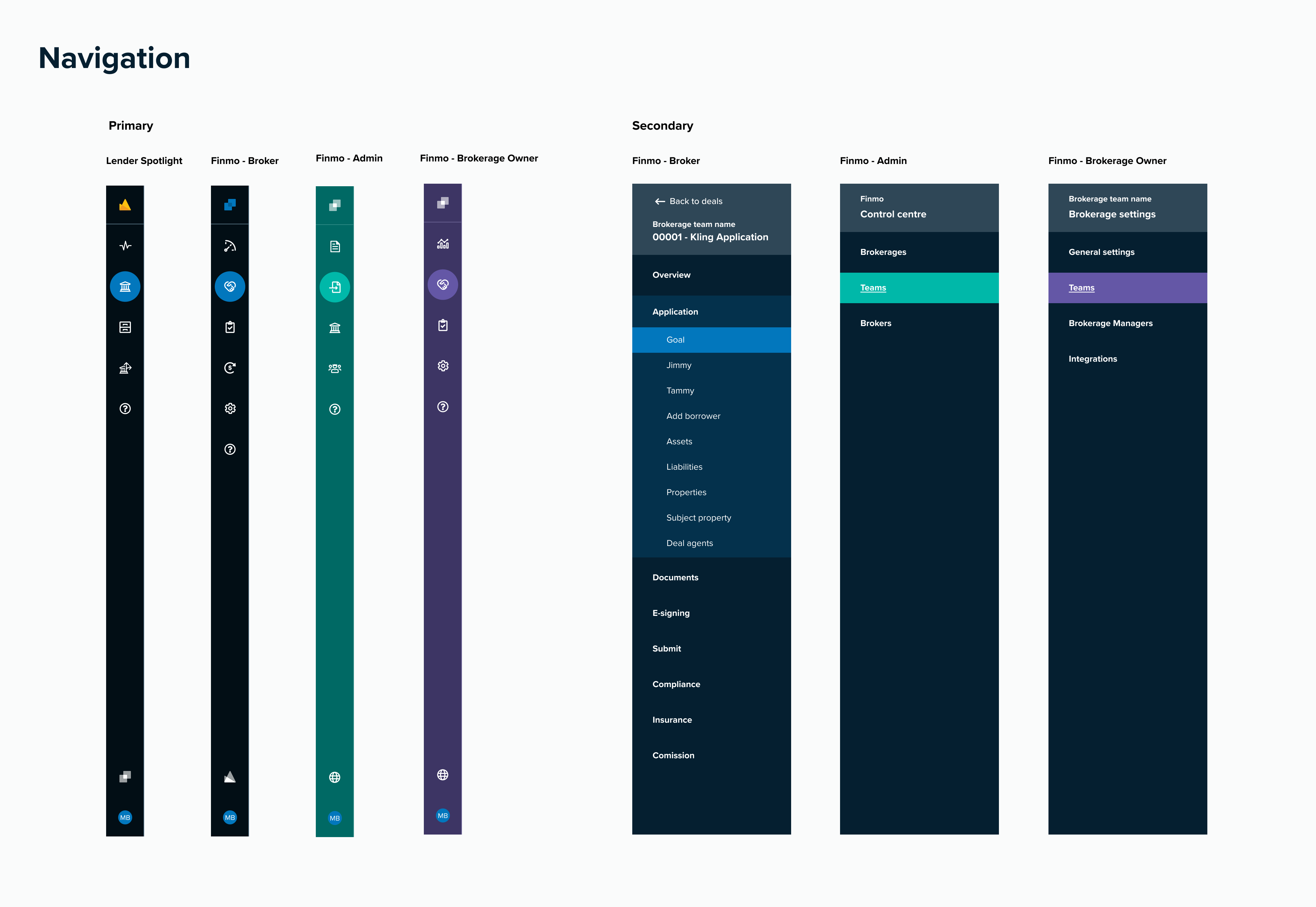
Text inputs, Selects, and Toggles


Buttons, Modals, Display elements, and Icons


Reflection: The lessons that stuck
This project permanently changed how I approach systems work.
What I learned:
Consistency must earn its way into the product through business-critical workflows.
Today, I:
- Ground system decisions in real user and business impact
- Start small, focusing on the areas that unlock the most value
- Approach design systems as infrastructure rather than artifacts
Including icons, badges, feedback (toasts and banners), tooltips, buttons, and modals.
Pacific applied to Finmo and Lender Spotlight

