Context and stakes: Why this mattered
Finmo had been in the market for years, serving mortgage brokers through complex, multi-step workflows. Over time, design decisions accumulated, but no one could clearly answer a fundamental question:
Which parts of the product actually matter most to users and where are we failing them?
Feedback existed everywhere:
- Customer Success conversations
- Sales calls
- ProductBoard requests
- Anecdotal Designer and PM intuition collected over past interviews
But it was:
- Fragmented
- Siloed
- Inaccessible to decision makers
The real risk wasn’t poor UX in isolation, it was making roadmap decisions without a shared and reliable understanding of user pain.
Ownership and action: What I took on
There was no mandate, roadmap item, or business metric asking for this work.
I stepped in because I saw a structural gap:
- Design feedback could not compete with revenue, delivery, or engineering signals
- UX pain was discussed, but not convincing enough at a leadership or strategy level
I took ownership of:
- Defining what we should measure about UX (not just how)
- Creating a shared model of the product experience that teams could reason about
- Translating qualitative feedback into comparable, actionable signals
This wasn’t about fixing a feature, it was about building a framework for making better decisions.
Strategic framing: The actual design problem

The design problem was not “users are unhappy.” The design problem was:
We lacked a shared, clear mental model of the Finmo user experience, making it difficult for teams to prioritize improvements with confidence.
So instead of starting with screens, I started with a structure to holistically understand the persona as they navigated key workflows.
I asked:
- What are the core jobs users hire Finmo to do?
- Which user tasks are most critical to a successful experience?
- Where does friction appear across key workflows?
Research system: Creating clarity

Step 1: Define the experience model
I worked with a PM and another designer to map:
- User jobs (end-to-end outcomes)
- Important tasks within each job
- The sequence and relationships between them
This created an easy to understand map of the Finmo experience, something the organization didn’t previously have.
Step 2: Validate language and structure
Before surveying users, I validated the model with:
- Sales
- Customer Success
This ensured we weren’t measuring the wrong things.
Step 3: Quantify pain without losing context


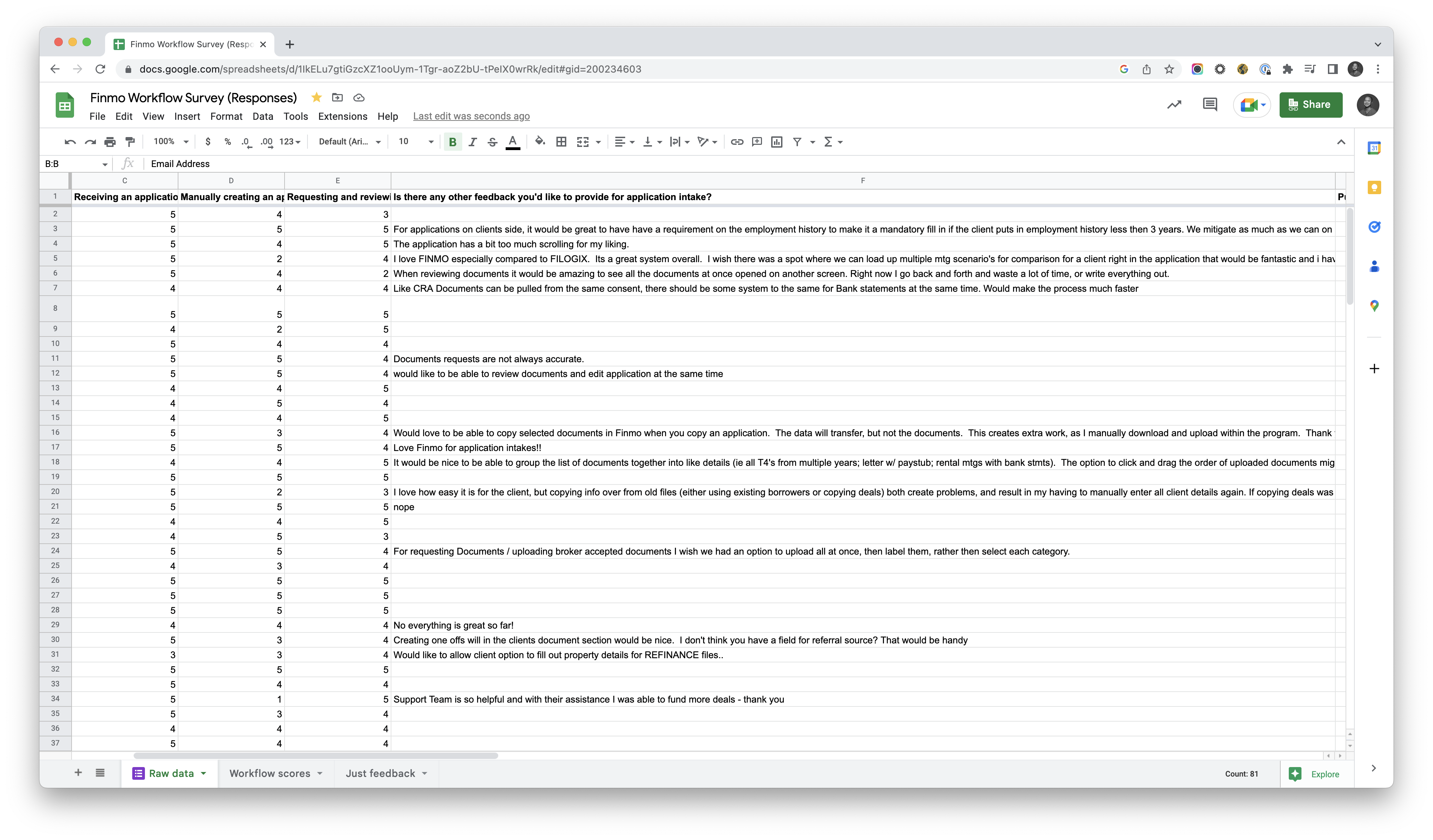
I designed a survey that:
- Used scaled questions to reduce response effort while ensuring comparability
- Paired scores with qualitative responses to preserve important context
- Focused on critical workflows, not specific features
The goal wasn’t perfect statistics; it was about enabling confident decisions.
Strategic decisions and tradeoffs
Decisions I made:
- Measured workflow scores, not feature scores because pain compounds across steps
- De-emphasized 3/5, 4/5, and 5/5 scores to concentrate on genuine failure points
- Prioritized signal consistency over achieving a perfect response rate
Tradeoffs I Accepted:
- A 15% response rate was enough to establish clear directional insight (average is 5% to 30%)
- There were no winners in the identified workflows, the intent was to reveal a priority landscape teams could use to guide tradeoffs with ongoing feature work
Outcomes and leverage: What changed

Immediate impact
- Identified the most painful workflows, not just disliked features
- Created a single source of truth for UX pain across Finmo
- Aligned Sales, Customer success, PM, Engineering, and Design around the same problems
Strategic impact


- Design gained credibility as a driver of strategy, not just execution
- The findings directly informed quarterly product strategy, funding projects such as Modifying Application Details
- UX improvements were formalized as a part of product OKRs instead of being confined to design-only backlog items
This work changed how Finmo decided what to fix, not just what to fix.
Reflection: How this shapes my work today
This project fundamentally changed how I approach complex systems with interdependencies across various platform surfaces.
It reinforced a few core principles I carry into my work:
- Structure and understanding must come before solutions
- What’s visible can be prioritized, what’s hidden cannot
- Research must be accessible to non-designers to really matter
Today, when working on information architecture or configuration-heavy areas, I start by asking:
How do we make the system understandable enough for teams to reason about it together?
This shared understanding is what enables confident decisions and ultimately allows design to scale.